Hey, and a warm welcome back to today’s post. This time we are going to look at How To Create A Pin People Want To Click Like Crazy on Pinterest.
The designs of Pinterest pins vary greatly some are Awesome! some are okay and some are just plain wrong.
When I first started using Pinterest my pins fell into the plain terrible category.
With practice I have gotten a little bit better, I can have a week of making really nice pins that get clicks and saves regularly, and then I’m pushed for time and rushing to get them made and they end up Awful.
Don’t rush the process is one important lesson to learn!
A blogger friend of mine has had lots of viral pins.
I’m certain that I’m not the only blogger who wants to know how to make a pin go viral on Pinterest?
Imagine my surprise when she offered to make a few pins for me!
I have had the use of the pins as templates to redesign new pins for my new posts from Elizabeth who no longer has a blog.
I am a part of her Facebook Group and she very kindly made me some Pinterest Pins as well as the Logo for this blog.
I have learned a huge amount about making pins for Pinterest from the pins Elizabeth Made.
This post may contain affiliate links which means a small commission can be made if you make a purchase through one of the links. The price you pay will not be affected.
Let’s dive in and see what matters the most in the process:
The Size Of The Pin Matters
It’s extremely important to make sure your pins are vertical.
Square is no good and won’t be popular or clicked on very often as it’s not favoured by the Pinterest algorithm.
The pins should either be a 1:2 ratio or a 2:3. When designing pins in Canva you will see the setting already there for you.
1000 x 1500 px and if you keep it set at that the pins will always be accepted in the uploading process on Pinterest.
You will see different sized pins which are great as long as you make them taller rather than wider.
Have you tried making any different-sized Pins?
The Photo On The Pin
The photo you choose for your pin should be in keeping with what the pin is going to be about, what exactly does that mean?
Your subject is Weightloss But the picture on your pin shows a laptop computer on a desk with a vase of flowers.
Pinterest will not know what category to put your pin in, I sincerely hope this makes sense to you?
As a blogger who blogs about blogging and using Pinterest (try saying that 3 times after a couple of glasses of vino) the majority of my pins have a computer on them as that’s the main tool used to write blog posts.
Occasionally the image will have a mobile phone or an Ipad.
The next part to take into consideration is the quality of the photo, ensure it is crisp and bright as opposed to being blurry, dark, and pixelated.
You need to capture people’s attention in a split second, like clicking your fingers. Blink and they are gone so get this right!

The Text On The Pin
You really need to make the text jump out at the person scrolling.
At the beginning of making pins, I liked to use script fonts in dazzling colours. They really are a no-no. Most people won’t stop their scroll to see what is written on the pin.
There are some stunningly designed pins but if you can’t read what the pin is all about what is the point of making it?
- Concentrate on what is written on the pin.
- Is the headline something captivating that makes you want to click on it?
- Think about the Fonts you are choosing can they be read when scrolling fast?
- Think in terms of the way the headline will be interpreted?
- Do the main points of the text jump out at you?
- Are you capturing people’s attention?
- Are you appealing to people’s emotions?
- Are you answering a question?
These are the questions you should be thinking about before you submit your pin.
The Colours Really Matter
Until Elizabeth designed the pins for me I had no branding!
I just used any old colour that took my fancy, some pins came out really okay and some most definitely didn’t :-).
That doesn’t mean I didn’t get saves and clicks, it just means the pins would have gotten even more of each just as the new pins have since I started to use them.
The difference in just a few days has been ridiculous!
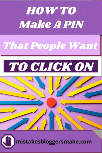
I chose the colour palette and Elizabeth did the rest Here is an example of one of the pins:

As you can see the text pops on the important points and yes there is scripted writing But, it’s easy to read even when scrolling!
Another point to remember when it comes to colour is light background dark font and dark background light font. When I’m using a template I often forget to change it!
I see many beautiful pins in all different colours and fonts and that’s okay if you are artistic!
If you look at my first attempts you can see that I’m not.
When you are scrolling on Pinterest what makes you stop and click on a pin?
These are the points you need to think more about is it the colour that draws you in? the font size? The Image? or a combination of them all?
There are certain colours that go together well and some just don’t work at all.
Keep trying and don’t delete any pins. This way you will see how far you have come in a short period of time.
I’m not typical in the scrolling regard if it’s hard to read I will take the time to check it out.
99% of others Don’t.
This is mainly because they are using a mobile phone and I use a laptop.
Pin Design
I sometimes cheat with pin design this can be achieved by anyone using Tailwind.
They have a new feature where you can add a specific photo or scroll through their selection and find a stock photo, add a colour template and 2 font types and the application will make the pin for you.
It makes tons of them and you can even edit them before making a final selection. You will receive 15 designs a month!
I have grown to love making pins myself, but every now and then you can get new ideas from Tailwind.
How To Make Your Pins Jump Out!
This was a step I really struggled with!
After lots of practice, I came to realize how to make the words stand out.
By using the square feature in Canva you can make it into another shape, as you probably know you can stretch it across the whole pin to cover the image.
You can also make it transparent so you can still see some of the images and you can put it into different colours as well.
How this helps you:
If you scroll back up and look at that pin, you will see the word Adsense, It really stands out and it’s not just because of the font that was used, it’s also because of the shape underneath it that started out life as a square.
The square is probably the most used shape in any pin design, it is used to build layers for your text to go on!
Good design is imperative.
would that pin make you stop and click it?
A and B Testing
When designing pins you should always do testing to see what your audience clicks on.
We are all aware that Pinterest loves new pins and that they get the most attention!
Make 2 or 3 pins with similar titles and use different colours, fonts, and sizes to get an idea of what is going to work for you.
If something works then stick to it.
Kick what doesn’t work to the curb and go back to the drawing board.
One point to be aware of if you are not getting clicks it could be just the title that is the problem?
not the design or the fonts used.
Everything about the pin is just perfect But, the way the title is phrased may not be unique enough to get the click!
Bonus Tip:
go and check out your pins on your mobile to make sure they are readable.
Unless you are a graphic designer it’s going to be trial and error for us all.
Elizabeth has had some viral pins so I was extremely lucky that she made some pins for me.
This post is part of a Pinterest mini-course and is part 5 of 5:
Part 1: Is Pinterest Right For Your Business? It’s Not One Size Fits All
Part 2: 5 Top Tips To Stop Your Pinterest Account From Being Suspended
Part 3: Which Pin Creator Should We Choose From 5 Examples?
Part 4: Which Pinterest pinning strategy is the best Manual or Scheduled?
Part 5: How To Make A Pin People Want To click On
If you have enjoyed this post then pin me, please!
Thanks for reading, I’ll see you in the next post!
This is great! I am just starting with Pinterest and I want to get everything right. Thanks for sharing this.
Happy To Be Of service!
Lisa.